What I did
- Product Design
- Research
- User Experience
- Information Architecture
- User Interface
- Visual Identity
- Product Strategy
- Copywriting
- Semi-responsive Design & Build
- HTML5
- CSS3
Evolve My Retirement is an exciting new startup focused on providing more realistic and helpful retirement planning.
Founder Nick May approached us with the brief of merging his functioning prototype with an improved user experience structure and design. The application works through a genetic algorithm that generates possible futures for the user based on a set of assumptions and the user's financial information.
Our goal was to simplify the end interface so as to ensure that users could easily use and understand the process even if they were not familiar with the theories being used.
The Brief
Evolve my retirement is a startup focused on providing more realistic and helpful retirement planning. Evolve My Retirement has a functioning prototype of the processes needed to give such advice, however, this prototype is hard to use and the results are not easily understandable without explanation.
The Brief is to create a simple-to-use interface that makes the process more user friendly, and interprets and provides these results in a way that allows users to understand it.
The application should answer this question: Am I on track for retirement, or do I need to consider a financial advisor?
Defining the product
Problem:
This is a new service in a marketplace that is crowded with similar services
Solution:
We must define key strengths and leverage these in Launch Strategy and UX to differentiate the product.
We found that the product had two main strengths - of all the competitors, it produced the most realistic results by considering possible financial fluctuations in its predictions. Secondly, it’s the only product on the market using a genetic algorithm to produce an optimised retirement plan.
Genetic algorithms mimic the process of natural selection, testing multiple strategies and carrying over the best traits to find which one is the “fittest”.
The project was originally called OkinawaZest, as Okinawa has the highest concentration of centenarians in the world. However, the name didn't make sense without the back story, and didn't tell the user what the product does.
We wanted to introduce users to the more exciting concept of using natural selection for better results.
We collectively decided a better name would be Evolve My Retirement. It was more catchy, understandable and relevant to the product.
We also decided to highlight the concept of "evolving" in the copy both within the application and in future marketing pushes.
Making it feel reliable
Problem:
The User Needs to disclose potentially sensitive information about their financial situation, and must trust that the application will not misuse this information
Solution
We need to ensure that the look and feel, voice and tone as well as the informational text on the website reflects reliability and reassurance.
We kept the look and feel simple and friendly, with slightly rounded corners and a light, green colour scheme. While a number of competitors seemed to lean towards more mature darker purple and blue hues, we decided that green gave the product a fresher look and also tied in with the natural theme of "evolving".
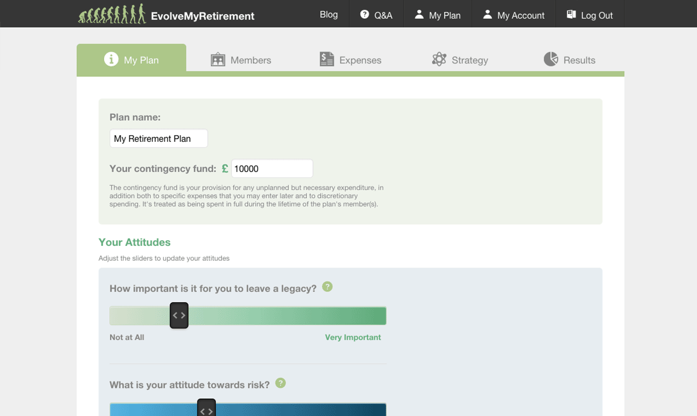
Wherever we thought a concept or label might need more explanation, we either included a tooltip or help text depending on how much explanation was needed for the user to fully understand what was being asked of them, and why the application needs the information.
Designing for Data entry
Problem:
The User needs to fill in a lot of information in order to get reliable results
Solution
We need to make this process easy and where possible, make the entry feel more meaningful
The main complication in finding a user-friendly structure is that there are multiple “levels” in one account:
-
User
-
Plans
-
Individual Plan
- Plan level General details
-
Members (up to 2 per plan)
- Member Level General Details
- Member Level Detailed info
-
Individual Plan
-
Plans
We decided it would be beneficial for the user to create up to two retirement plans - allowing them to create a plan on behalf of someone close to them (children or parents) or even to create an experimental plan.The user can also have two members for each plan, as married couples would share their retirement plan.
Some information needed to be entered per member, and some information was general to the plan. Expenses could be both joint as well as separate. We decided to split the information entry into three main sections: My Plan (general details), Members (Member Specific Information) and Expenses. The Members section is subdivided into two levels
- Member
- Details for each member -> Member Information, Annuities, Employments, Self-Employments, Debts, Life Insurances.
In this way the user has a clear separation between the two member's details but can also easily navigate between them.
We display the expenses data both as a table as well as a graph in order to show the user what the distribution of their essential expenses is like. This allowed us to add more value to the information entry as the user can use the application both to have an overview of their current financial situation as well as for retirement planning purposes.
Making sense of the data
Problem:
The two outputted results from the prototype are confusing - one shows the outcome of a single sample trial and another shows a score rating the results from 1 to 10.
Solution:
Interpret the results to find what key points will be valuable for the user, then display these in an easily understandable way.
The most difficult part of the project was finding a way to explain the concepts of the optimisation, strategy and results. The strategy is really the main takeaway for the user - it shows the optimal financial decisions they can take to prevent themselves from running out of money. However, these are complicated and abstracted financial behaviours that are hard to translate into real impact for the user. Instead, we decided to create a tab for “results” of a strategy, which would provide the user with the answers to the main question of the brief: am I on the right track, or do I need to consider a financial advisor?
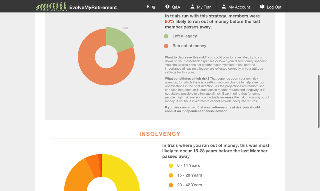
We extracted three main messages from the outputted data:
1. If you followed this strategy, this is how likely you are to run out of money before you die.
This answers the most pressing question. We show the percentage of trials in which the user ran out of money before the death of the first money.
2. If you do run out of money before you die, this is when it is most likely to occur
This adds context to 1. Running out of money 1 year before your predicted death would be much less of a worry that being likely to run out 30 years before.
3. If you leave a legacy, this is what you’re most likely to leave behind.
This adds more context to 1. If the user thinks it is important to leave a legacy, they may still want to consider changing their financial strategy to ensure they are leaving the legacy they desire.
We then supplemented these with other valuable information extracted from the member’s inputted information and the strategy that had been generated:
An overview of current finances
- What is my current combined net worth?
- What is my current combined annual income?
- What is my current combined annual expenses?
An overview of a crucial aspect from the strategy:
In the strategy I have chosen, how much luxury spending money do I have?
This was the most relatable and easily understandable part of strategy - luxury spending obviously affected the probability of running out of money as well as potential size of any legacy left. We highlighted this by showing the user their yearly luxury allowance and how much that meant per month and per month per member. This was to make it easier for them to get a sense of what they could do in their current situation to become more in line with the strategy.

