What I did
- Template/Platform Design
- User Experience
- User Interface
- Visual Identity
- HTML5/CSS3
- Responsive Design & Build
- Device Testing
Following on from the press portals project, Ubiquity Press wanted to revamp their platform for hosting academic journals.
They wanted to modernise the design in a way that encouraged users to engage with the content in new ways, and which improved both the reading and submission process.
The Brief
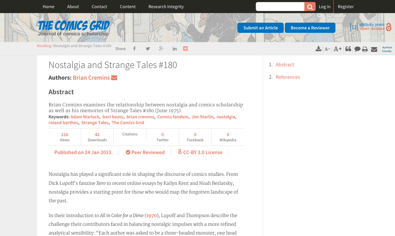
Ubiquity Press is an open access publisher of peer-reviewed academic journals, books and data. It also serves as a platform for academic societies and journals to collect and publish journal articles.
Ubiquity have the underlying backend and processes to launch their presses, but want a modern design that is in line with the innovative nature of their publishing model.
The brief is to create a HTML/SCSS template journal layout and design that can be customised to some extent by the participating journals.
Look & Feel
Problem:
The visual feel of the Ubiquity Journals pages needed to be in line with the design for the Ubiquity portal presses, while at the same time establish a distinctive look to set it apart and allow journals to customise their look.
Solution:
Carry over parts of the styling where appropriate, and focus on tailoring the layout to the journal’s purpose, which is different from the presses.
I carried over the typographical style that had been used for the Ubiquity portal presses. The typography suited the purpose and helped establish the connection between the two platforms.
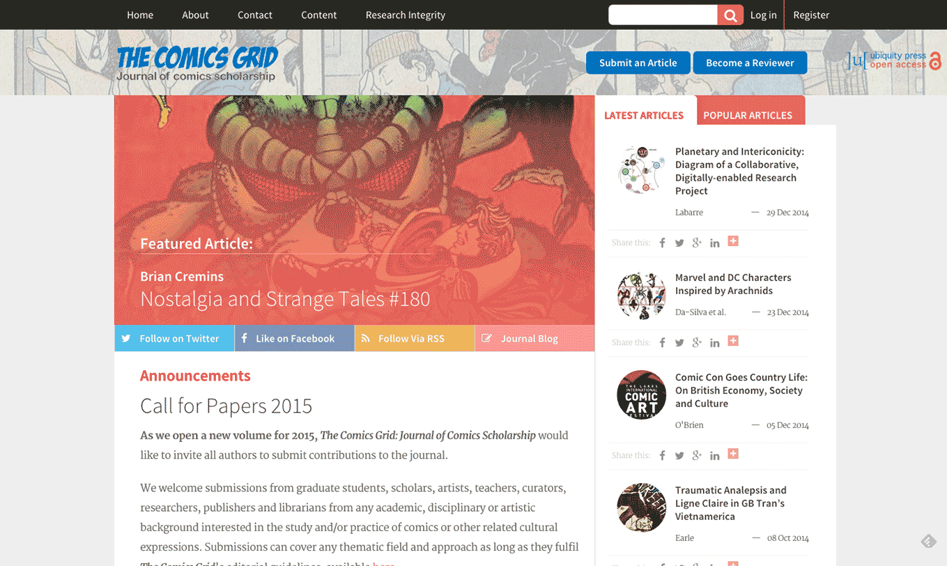
I also used a similar general layout by designing a similar navigation and brand header setup as on the portal presses.


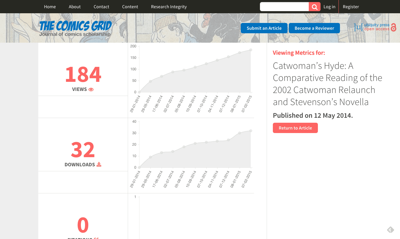
Since journals had previously been able to add a background image to their site, I reconfigured the setup of the headers so that it was easy to add a background image(with variable opacity) to the header element.
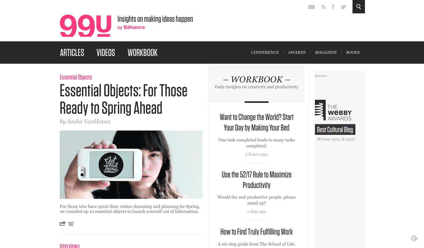
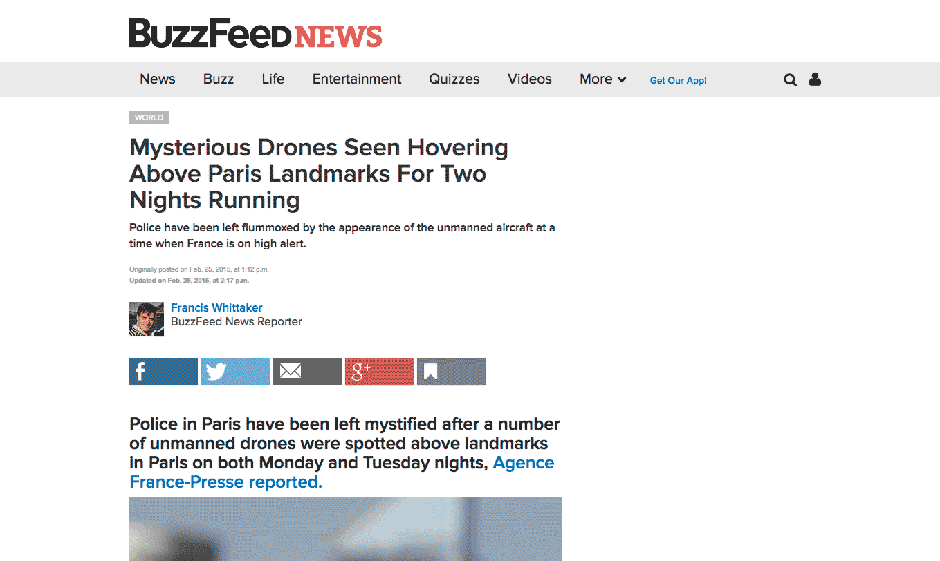
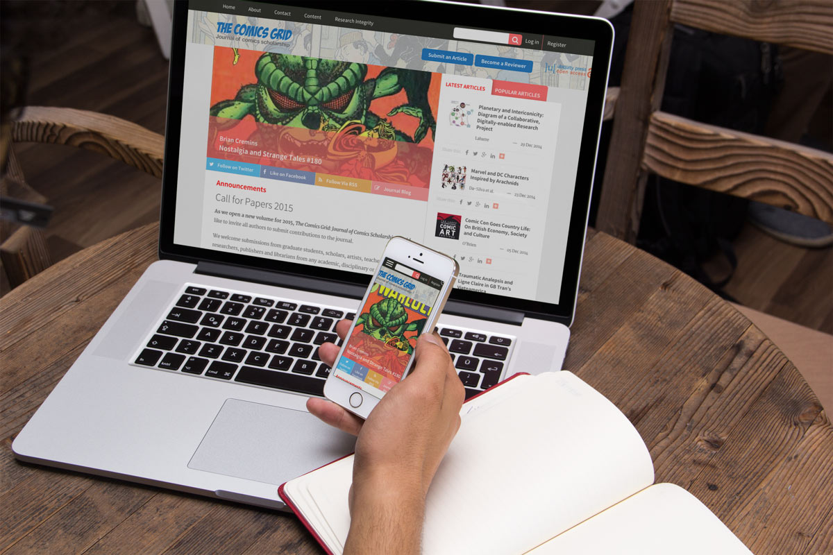
We wanted the journal to really look and feel like a modern online magazine, and drew layout inspiration from sites like 99U and Buzzfeed.
The two column split with “latest/trending articles“ on the left was a familiar pattern and fit very well within what the journal was trying to achieve.
Accessible Reading
Problem
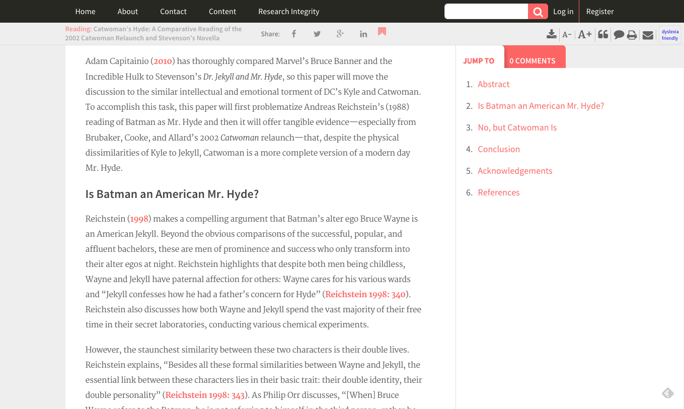
Ubiquitypress requested a couple of additions to the article page to improve the accessibility of the reading experience
Solution
Make sure there are options for readers to adjust their reading experience in a way that improves their experience of the site.
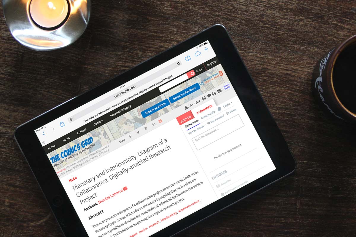
This was an especially interesting problem because ubiquity were interested in offering a “dyslexia friendly” option for their readers.
This worked by toggling the class “dyslexia-mode” on the article container. The styling adheres to the Dritish Dyslexia Association's official style guide
- The background of the container becomes light-yellow.
- The font size and line-height is slightly larger
- The main body font is changed to Arial
- Links are displayed in bold with a slightly darker yellow border below.
- Italics are shown as highlighted text.
In addition to “dyslexia friendly mode” we also added controls for the font size, and options to download articles as either XML or PDF.

Submitting Articles
Problem:
Ubiquitypress wanted to improve the submission system for article authors
Solution:
Modernise the process by splitting the submission into more digestible steps and removing any unnecessary inputs.
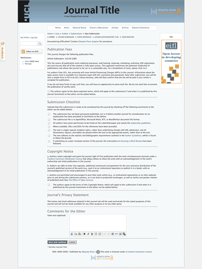
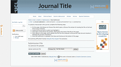
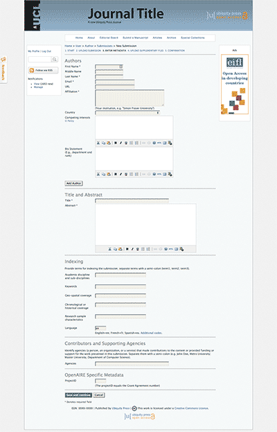
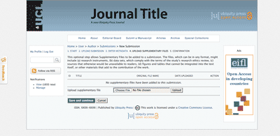
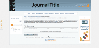
The original submission process was divided into five steps:
- Start
- Upload submission
- Enter metadata
- Upload supplementary files
- Confirmation
While there was some logic behind the structure there were also a lot of issues with it:
- The 3rd step was much too long
- It was almost impossible to add multiple authors to the same arcticle
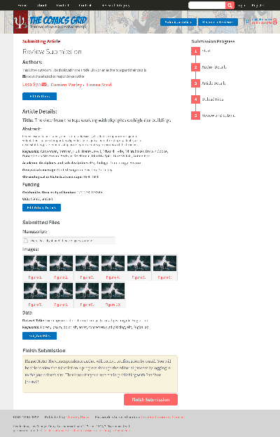
- The confirmation stage only showed uploaded files, but no other information about the submission.
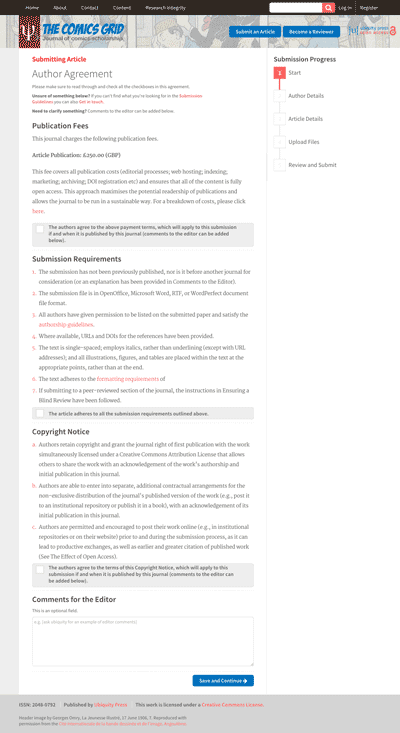
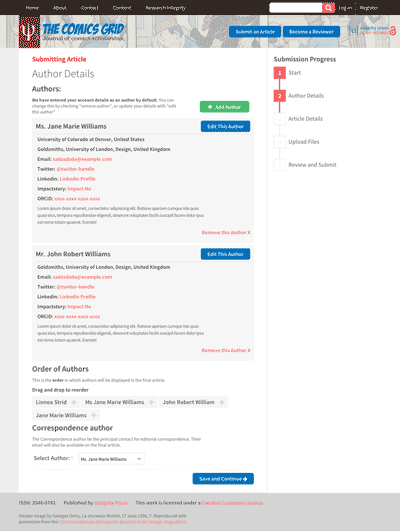
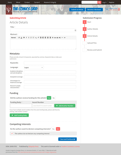
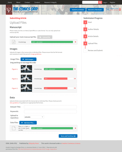
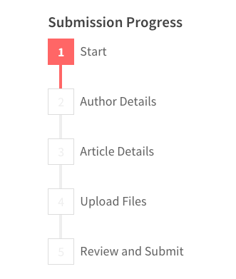
The final version divided the submission into these steps:
- Start
- Author Details
- Article Details
- Upload Files
- Review and Submit
The previous process was extra confusing because the step names didn’t describe the information needed. The main separation was now Author, Article detail, Files, making it easier for the user to determine what information was required in each step.
The previous process was extra confusing because the step names didn’t describe the information needed.
The main separation was now Author, Article detail, Files, making it easier for the user to determine what information was required in each step.
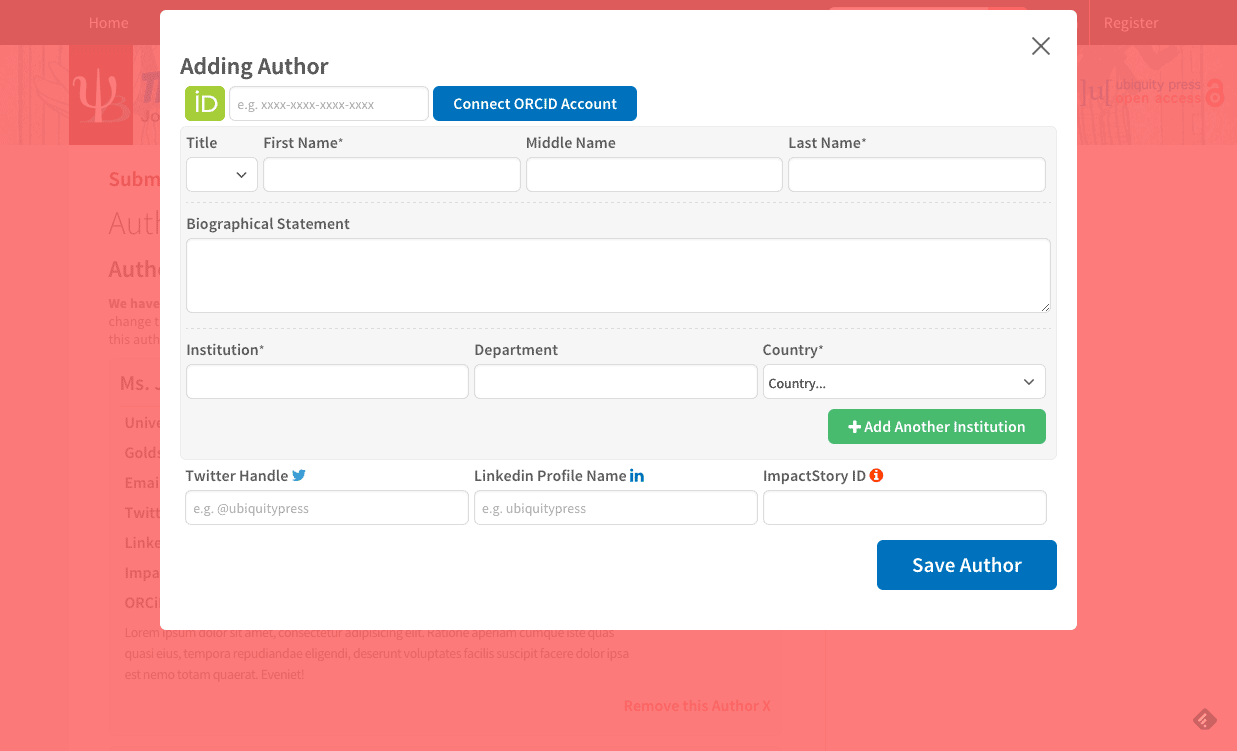
To make it easier to add and manage multiple authors, the form for authors was split out into a modal. This made it easier to overview what authors had already been added, as the page became much shorter.
The article details page, which required quite a lot of information, was also split into smaller subsections. All files were uploaded in the same place, as it made more sense. The review page was designed to show a condensed view of the information that had been submitted.
