What I did
- Template/Platform Design
- User Experience
- User Interface
- Visual Identity
- HTML5/CSS3
- Responsive Design & Build
- Device Testing
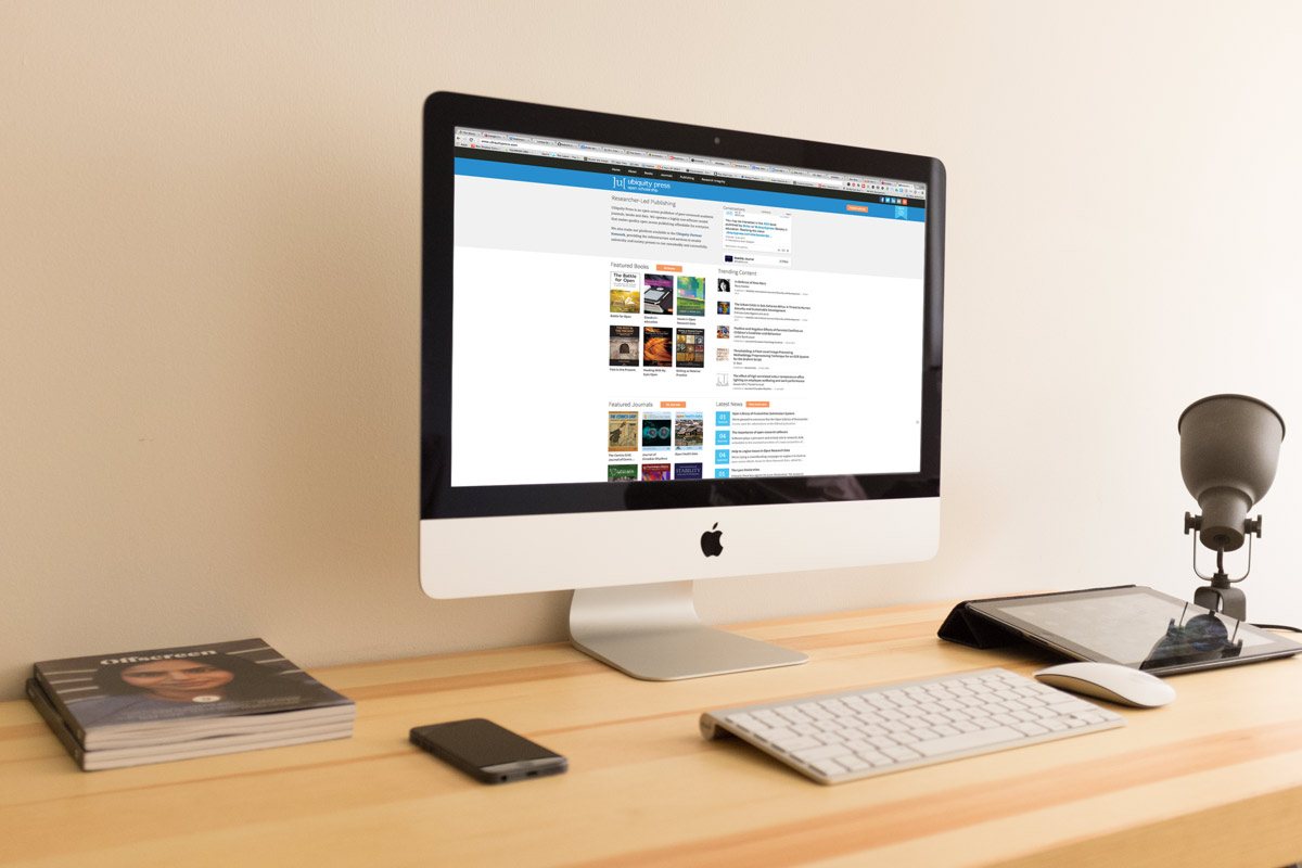
Ubiquity Press is an open access publisher of peer-reviewed academic journals, books and data.
They also serve as a platform for partnering universities to initialise their own open source publishing presses. Ubiquity Press wanted to create a template that they could use to set up their own and partner presses, allowing partners to customise their portals to suit their brand identity while maintaining a high quality user experience.
The goal was to make this template feel fresh & modern, allowing users to easily discuss, share and read books and journals published through the press portal.
The Brief
Ubiquity Press is an open access publisher of peer-reviewed academic journals, books and data. It also serves as a platform for partnering universities to initialise their own publishing presses. Ubiquity have the underlying backend and processes to launch their presses, but want a modern design that is in line with the innovative nature of their publishing model.
The brief is to create a HTML/SCSS template press layout and design that can be customised to some extent by partnering presses.
Look & Feel
Problem:
Ubiquity press provides a revolutionary publishing model that combines modern technology and established university practices, which can sometimes be at odds with each other
Solution:
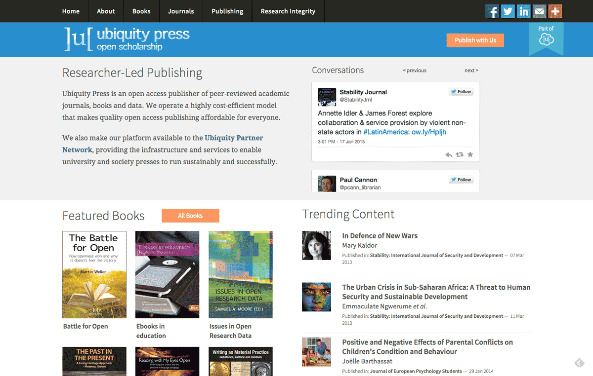
The design of the press template needs to have a modern feel while conveying academic authority
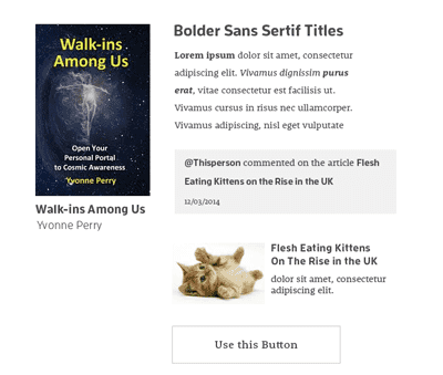
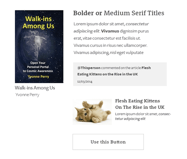
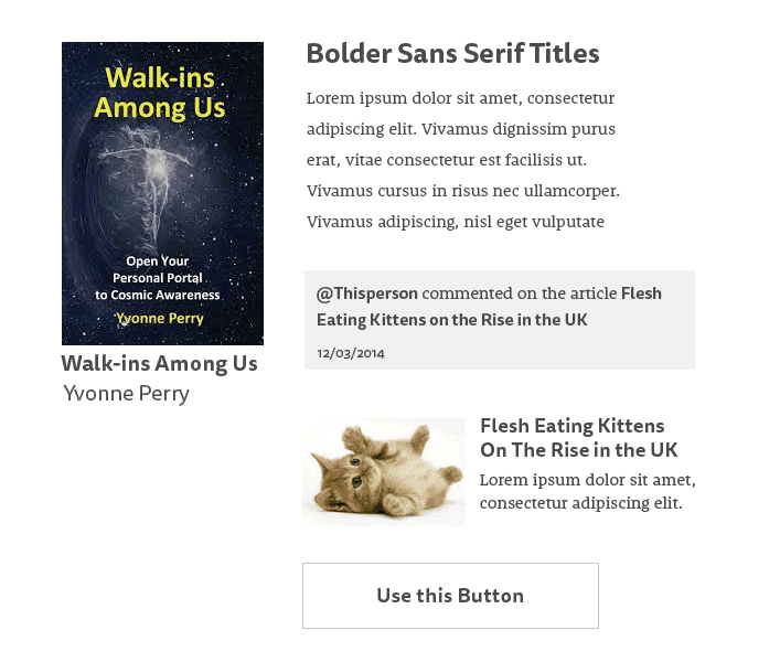
We started by deciding on typography. Since the presses would have a varying amount of content - sometimes busy and sometimes quite empty, fonts were important for establishing visual hierarchy.
While the original font pairings were taken from typekit (Source Sans Pro and Rooney Web) we ended up moving to google fonts as it was a more sustainable solution, using Droid Serif as a suitable replacement.
Source Sans Pro in thin has a very sleek and fresh look that brought an element of modernity, while the more standard but slightly softened Droid Serif kept the element of print that the presses are still involved in.

We took inspiration both from established online book stores and university websites as well as contemporary article sites and online news aggregators, blending them all together into a design on the line between modernity and tradition.

Customisation vs Usability
Problem:
The presses need to be customisable by partner presses, but must maintain a good user experience across the board.
Solution:
We must set the limitations for customisation to balance partner press needs with a consistent quality of user interface
We designed the HTML template to be
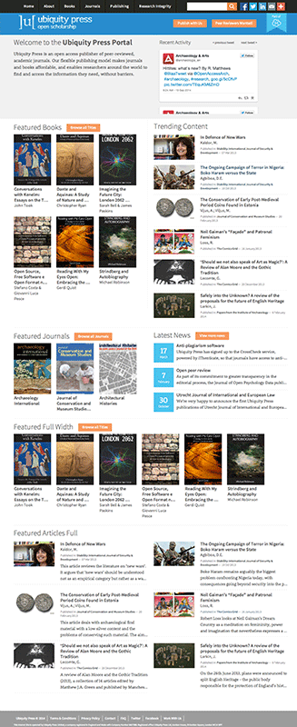
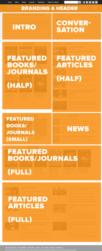
- Divided into blocks that could be easily mixed and matched within various layouts.
- Customisable from a main variables file.
As previously mentioned, we had decided that the visual hierarchy set by type would be important for creating order in both content-heavy and less populated presses.
The typography was designed to provide readability and clarity. Therefore, we decided that while there should be an easy way to choose a custom font family, we did not integrate font size control into the variable file.
We also decided to limit the layout styles to max 2 columns (each block taking up one column) as some blocks would not be useful if placed within a more narrow column, and because it had potential to cause issues with responsiveness going forward.
We limited the amount of brand colors to 4 to ensure that there wouldn’t be too much distraction if the colours happened to be very attention-grabbing. We also use colour quite sparingly on the template, but in a couple of key places where they help reinforce the brand identity of the press.
We knew we wouldn’t have control over the visual hierarchy once the presses started customising, so it was important to put down some kind of guide for how the colours would appear in the design.
Of the partner presses that have joined so far, this has proved quite successful. The way we implemented our "guide" was to name the variables in a way that reflected their prominence within the design.
- $brand-main-color
- $brand-secondary-color
- $brand-accent-color
- $brand-shadow-color
We found that this setup tended to provide a visually balanced colour scheme that would be close to what the partner press was using within their own branding.
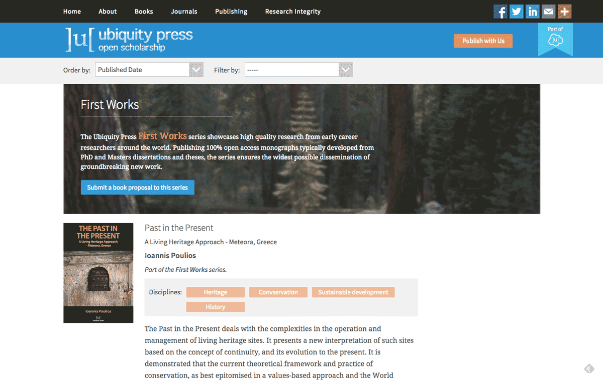
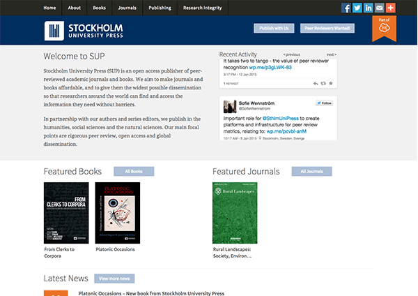
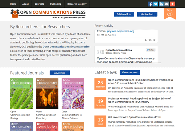
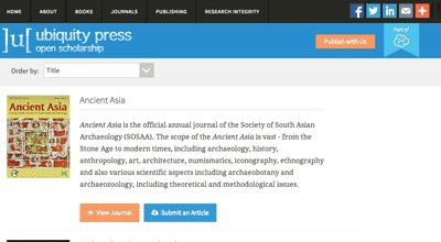
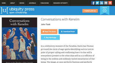
As you can see, there are still many similarities in appearance between presses, but the customisation elements allow you to quickly differentiate between them.
Dynamism & Social integration
Problems:
Ubiquity press are eager to introduce a feeling of dynamism and social interaction on their page
Solutions:
Design a way to integrate social sharing and feeds into the site without it feeling stale, out of place or forced.
This was really one of the biggest challenges in the project - how do you make a social feed interesting? We’ve all seen embedded twitter timelines, but they often feel a little forced, or like background fodder. Theres even adblockers to get rid of them!
Since twitter had updated their API to be more strict about display requirements, it had become harder to present tweets in a way that felt integrated and relevant to the actual site content.
Twitter's timelines have a lot of functionality, but can feel a bit out of place and forced in a design
While there were non-official ways to get around this, we wanted a sustainable solution that would allow us to retain all the functionality that comes with twitter’s timelines - ability to reply, favourite, retweet,and follow, without taking the user away from the site.
We decided embedded individual twitter cards were a good way to accomplish this. It gave us more freedom than twitter timelines, and Ubiquity’s team had found a way to systematically collect the relevant tweet ID’s needed to create a “timeline” of embedded twitter cards.
Hey, @ubiquitypress new website is quite fantastic http://t.co/A6Wkqa2wIY and you can download #openaccess ebooks in PDF, EPUB, Kindle
— Stefano Costa (@stekosteko) September 3, 2014Twitter cards provide a lot of functionality while being less restrictive than timelines
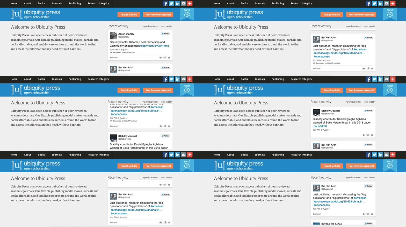
The concept was to have the tweets populate a list almost as if they were being tweeted in real time. We went through several iterations of this but ran into a number of issues due to technical limitations, as we were trying to create the effect via CSS animations on a timer.
The rationale behind pursuing a CSS only solution was that it was a little more lightweight and allowed the user to scroll through the tweets, however it caused a number of annoying user experience issues that outweighed the benefits.
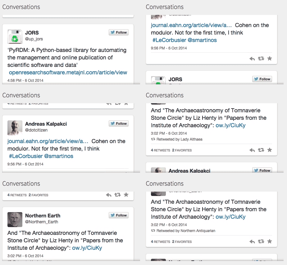
At last, we decided to go a javascript route - using the bxslider.js library to create a vertical slider. This didn’t allow users to scroll through tweets, but gave them the controls to flip through them instead. The result was a much less problematic feed that still gave the site a dynamic feel.
Screen Sizes & Design
Problem:
As the target audience will be in Universities, users may be viewing the site on smaller screens or tablets.
Solution:
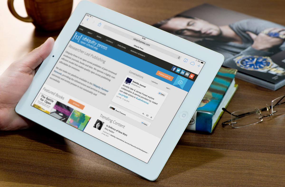
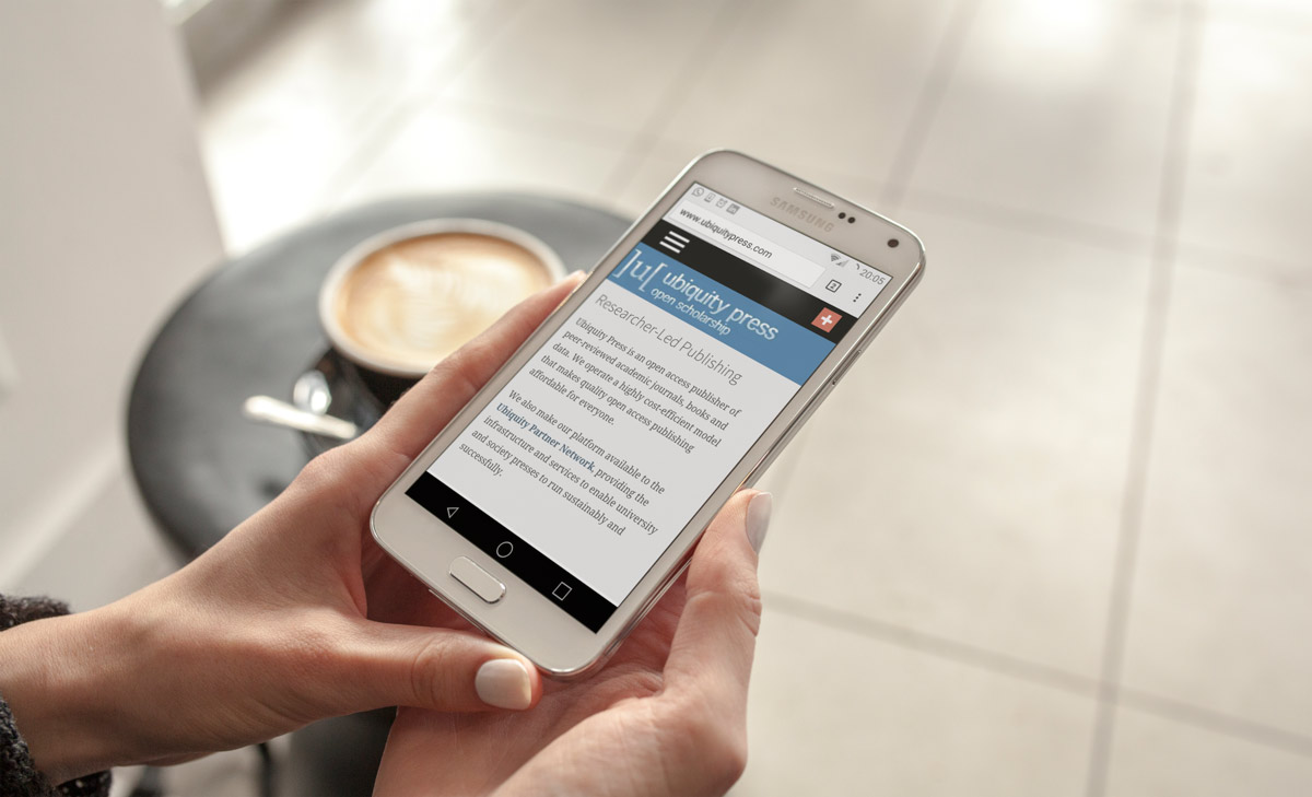
Design the site to be fully responsive, with extra focus on smaller screen sizes
When designing the site, we were keen on making it pleasant to use even at a very small height. This was because we assumed the user base was likely to use smaller screens such as laptops or older monitors. The actual window we used while we were designing the site was something like 1000 x 550 px - tiny, but appropriate on e.g a 13” screen.
Designing for smaller window sizes meant avoiding the use of overly large fonts, spaces or images in order to serve the user as much content and more importantly, context at any time.
Putting a lot of effort into the small screen experience did not mean that the big screen experience suffered - the result was simply a much tighter layout with concentrated, smaller packets of information.
